hoffman app
overview
The Hoffman Process is a renowned week-long healing retreat where participants learn how to transform the counterproductive beliefs and patterns that limit their happiness and potential. Over 100,000 people worldwide from all walks of life have completed the Hoffman Process and their community of graduates is incredibly passionate about their experience.
Hoffman asked Fresh to help them build an app that would support and inspire graduates to continue their self-discovery journey in their daily lives.
deliverables
Branding
iOS App
Wireframes
User Interface
Prototyping
software
Figma
AfterEffects
challenge
The Hoffman Institute had an established and successful story of helping individuals for over 50 years- but they’re branding and digital tools were beginning to fall behind. They came to Fresh Product Design with desire to update and modernize their iOS App and include an update of their logo in the process.
existing designs


embedded user research
We (the awesome team I work with at Fresh Product Design) believe the importance of knowing the customer and understanding their experience with the product. So, the first thing the Fresh team after we were hired- was enroll in a Hoffman course.
We knew we wouldn’t be able to build an app or develop a brand that resonates with Hoffman graduates if we did not have this shared experience. Taking the course also enabled us to refine the identity of the app. Through our first-hand experience, we were able to establish the perfect color palette, logo, and style approach.
* Due to non disclosure agreements - I can’t share with you any of the material from the training.
competitive analysis
Apps Reviewed
14 total apps reviewed
Most popular reviewed included: Calm, Headspace, & Insight Timer
High-Level Comp Analysis Findings
The mediative/mindfulness app space is crowded and growing more so as fitness firms enter the space. Many apps are clones in content and design aesthetic (for example Calm, Aura, Breethe). Apps typically employ calm and peaceful aesthetic with exception of the energetic approach of Headspace.
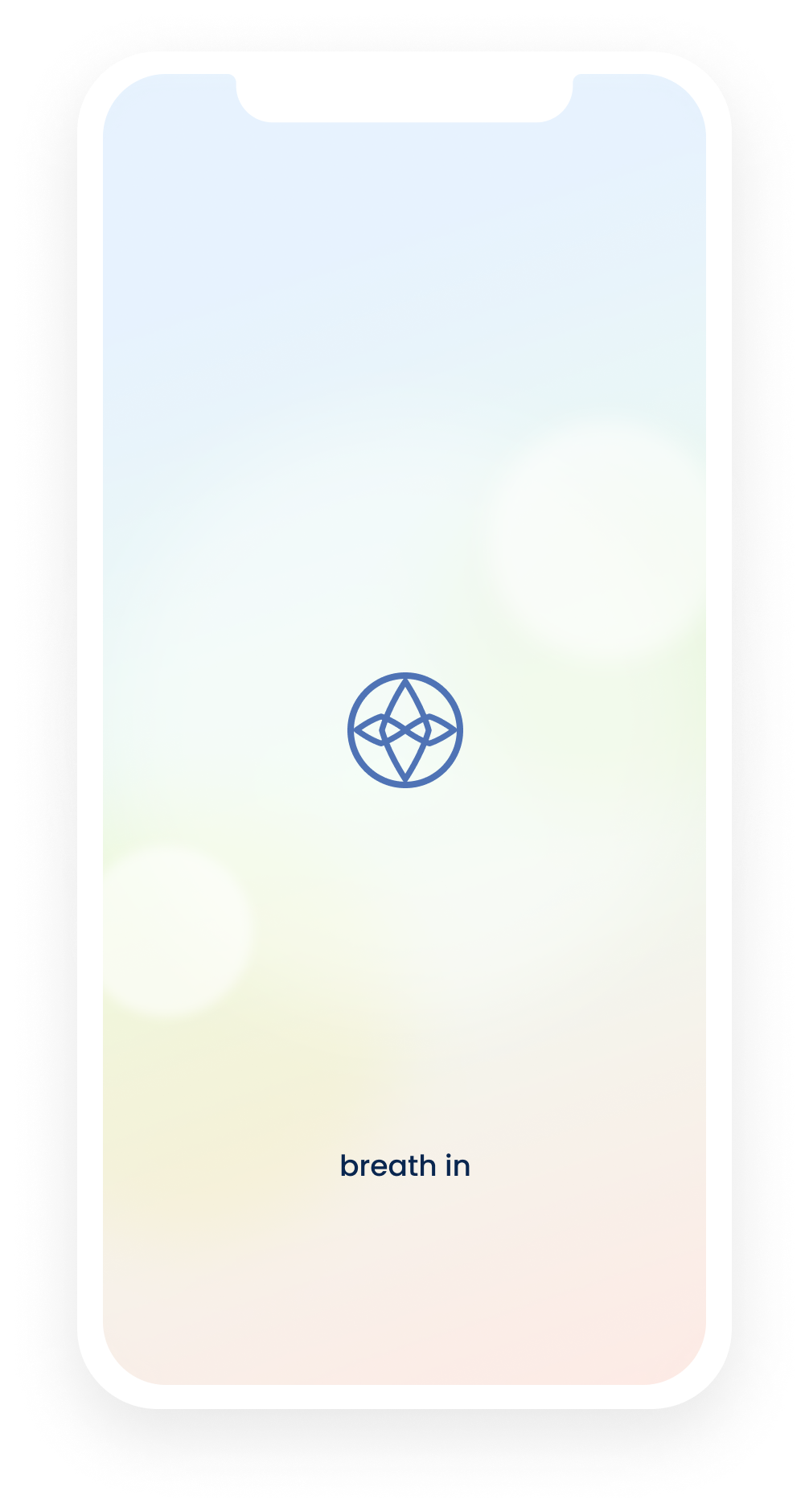
logo redesign
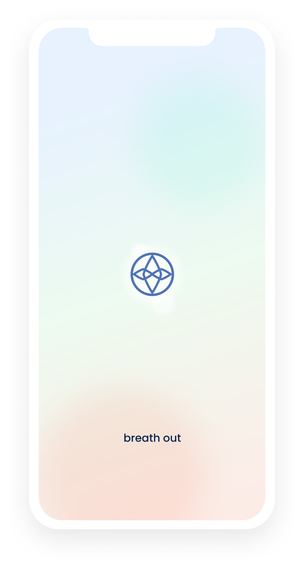
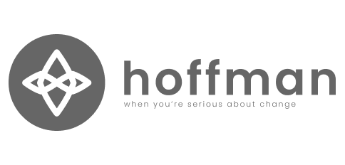
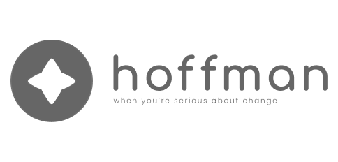
In tandem with the user research and competitive analysis- I started working on designs for a new logo to represent Hoffman’s mission and relevancy to the present. A few of the words given to me to capture the company’s brand and vision included: hope, joy, playful, potential, and peace.
So there was a task at hand to modernize the logo with those feelings while also paying attention to the history of exiting symbolism in place at Hoffman. There was an existing design of overlapping diamonds within a circle that holds a lot of importance to the mission of Hoffman. While dropped from the logo many years prior- there was a desire to potentially add it back in if possible.
logo exploration
final logo designs
We went through two rounds of changes- combining the first and second designs as well as adjusting the logo mark of overlapping to better represent the original design created by the Hoffman founder decades ago.
We also adjusted and expanded on their existing color palette to create a deeper sense of peace and calm.


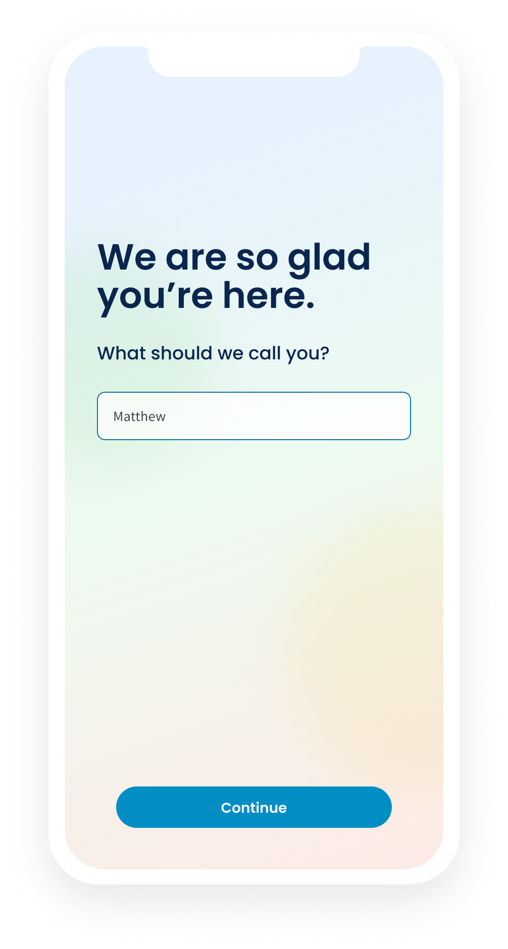
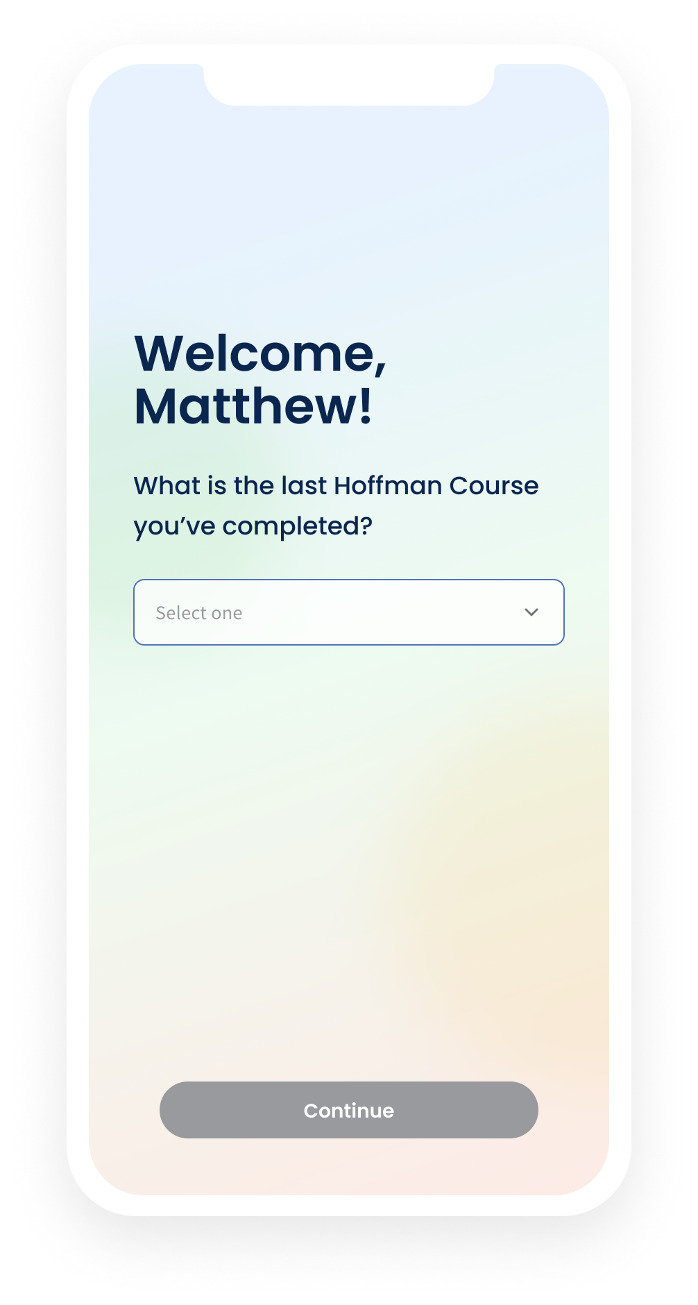
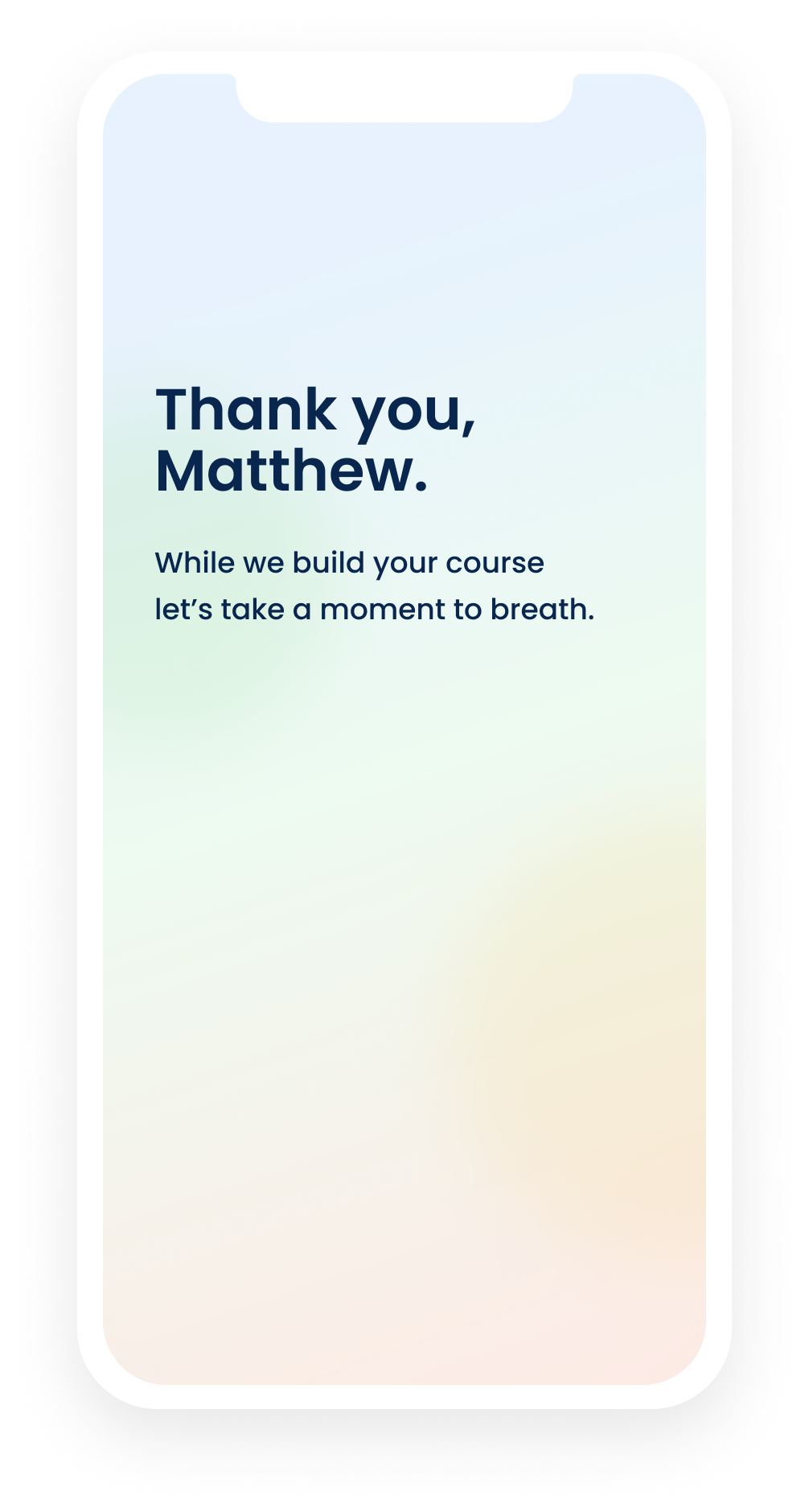
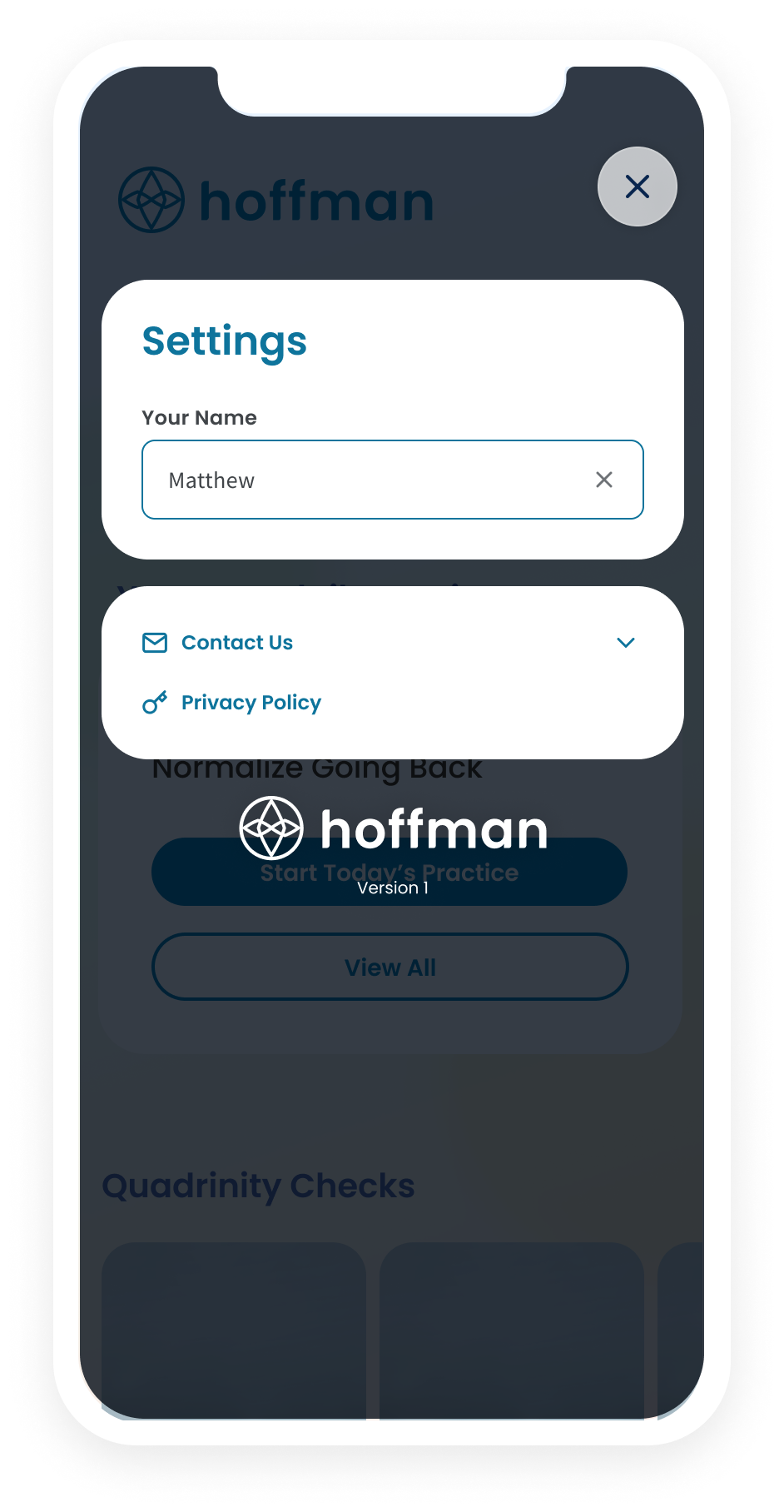
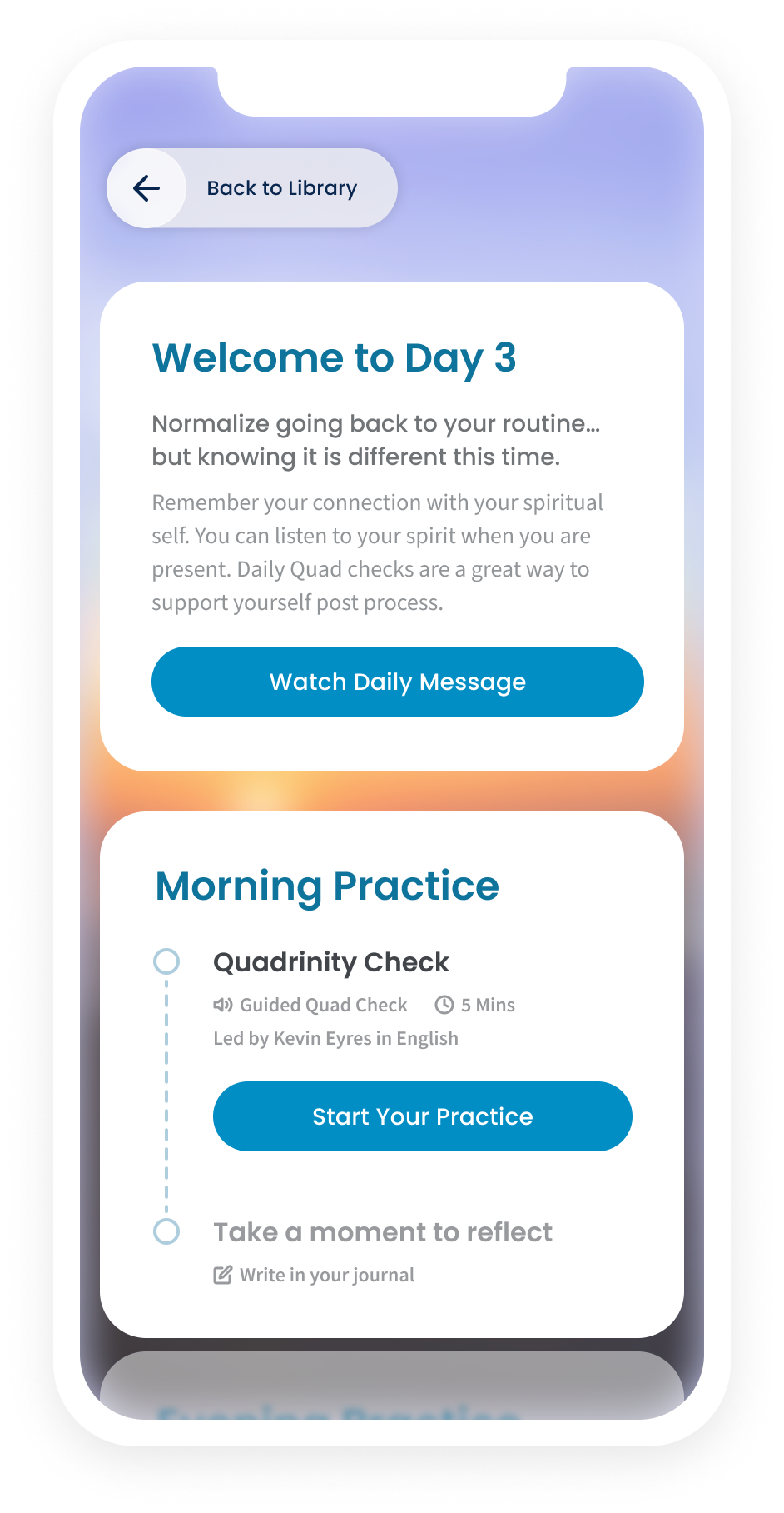
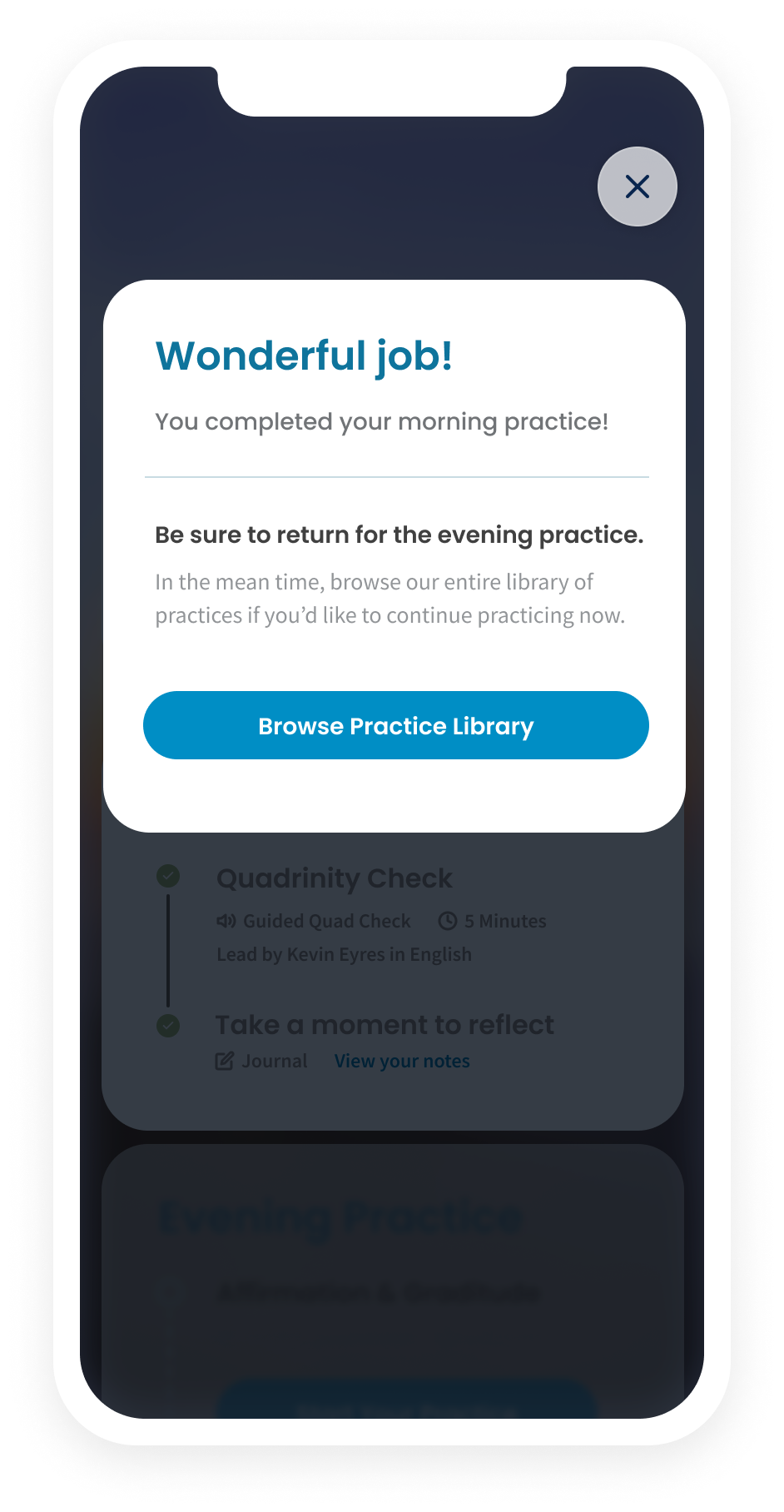
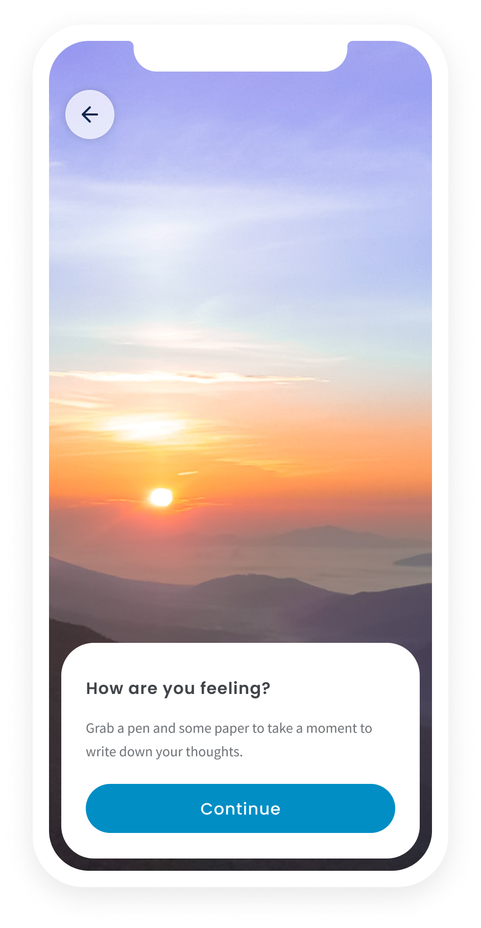
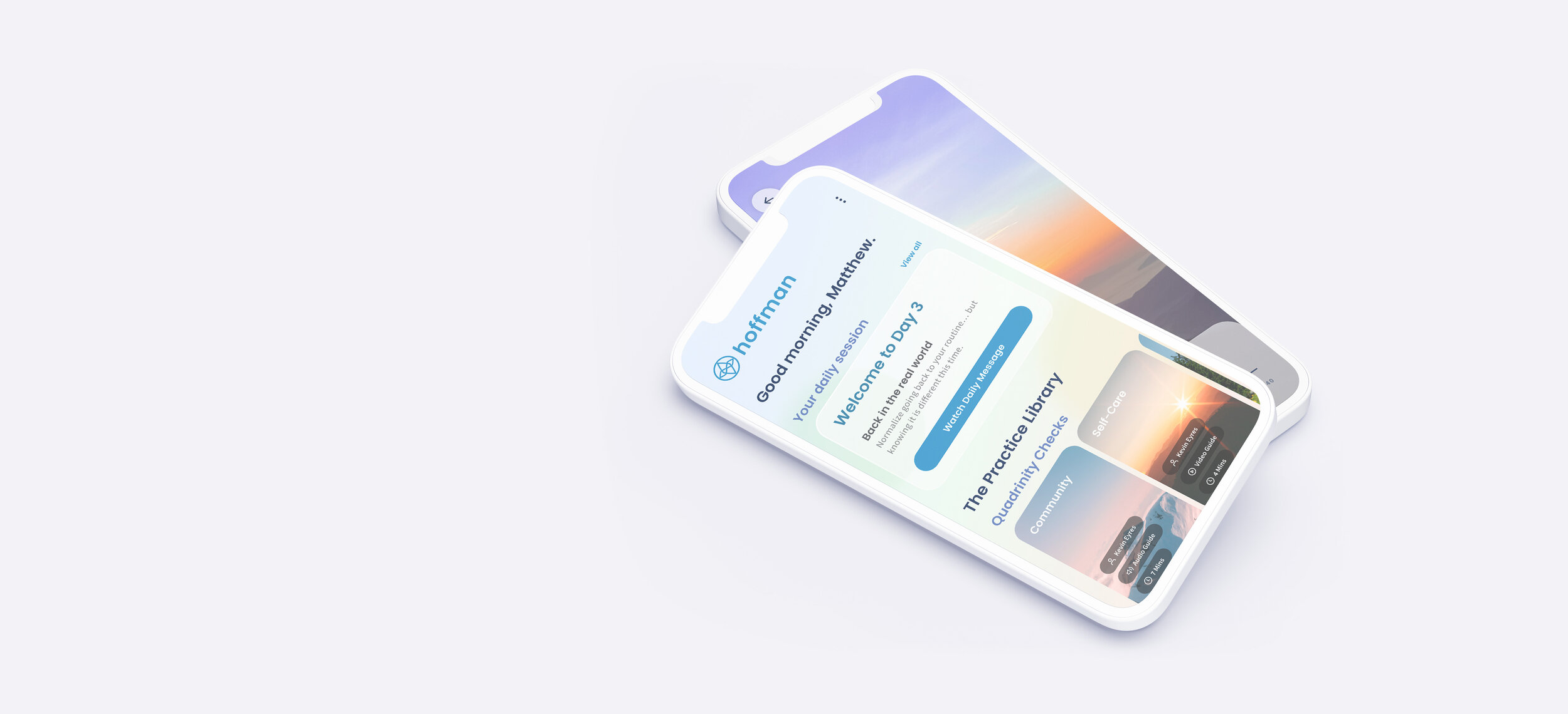
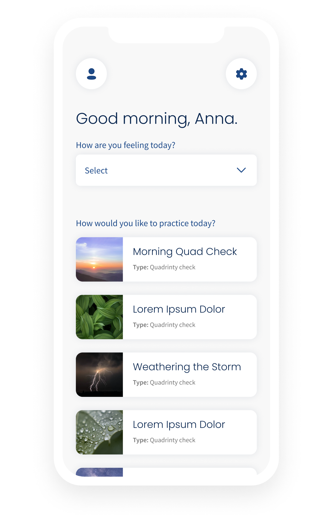
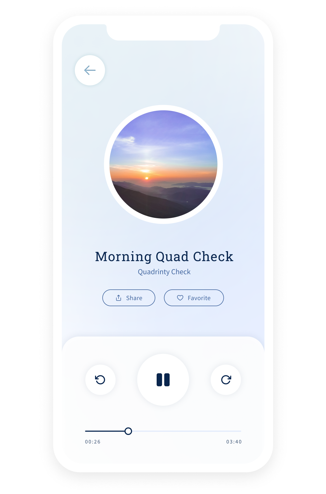
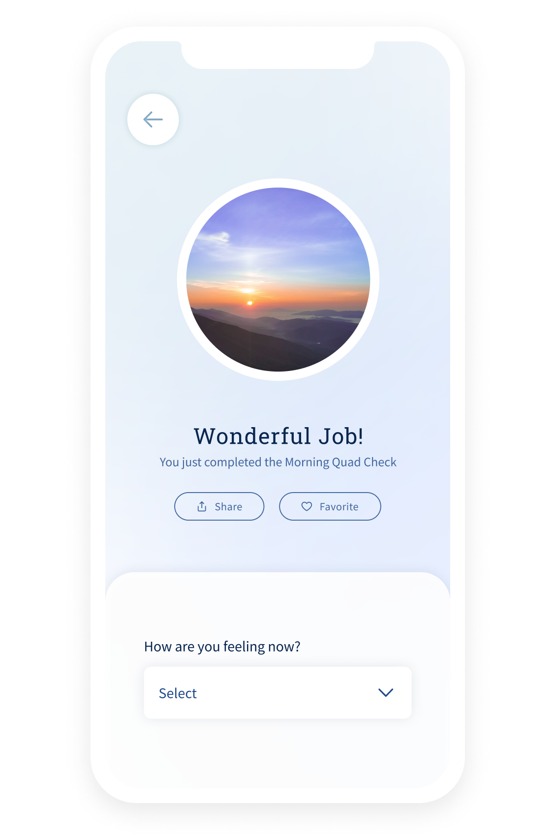
ui + ux design
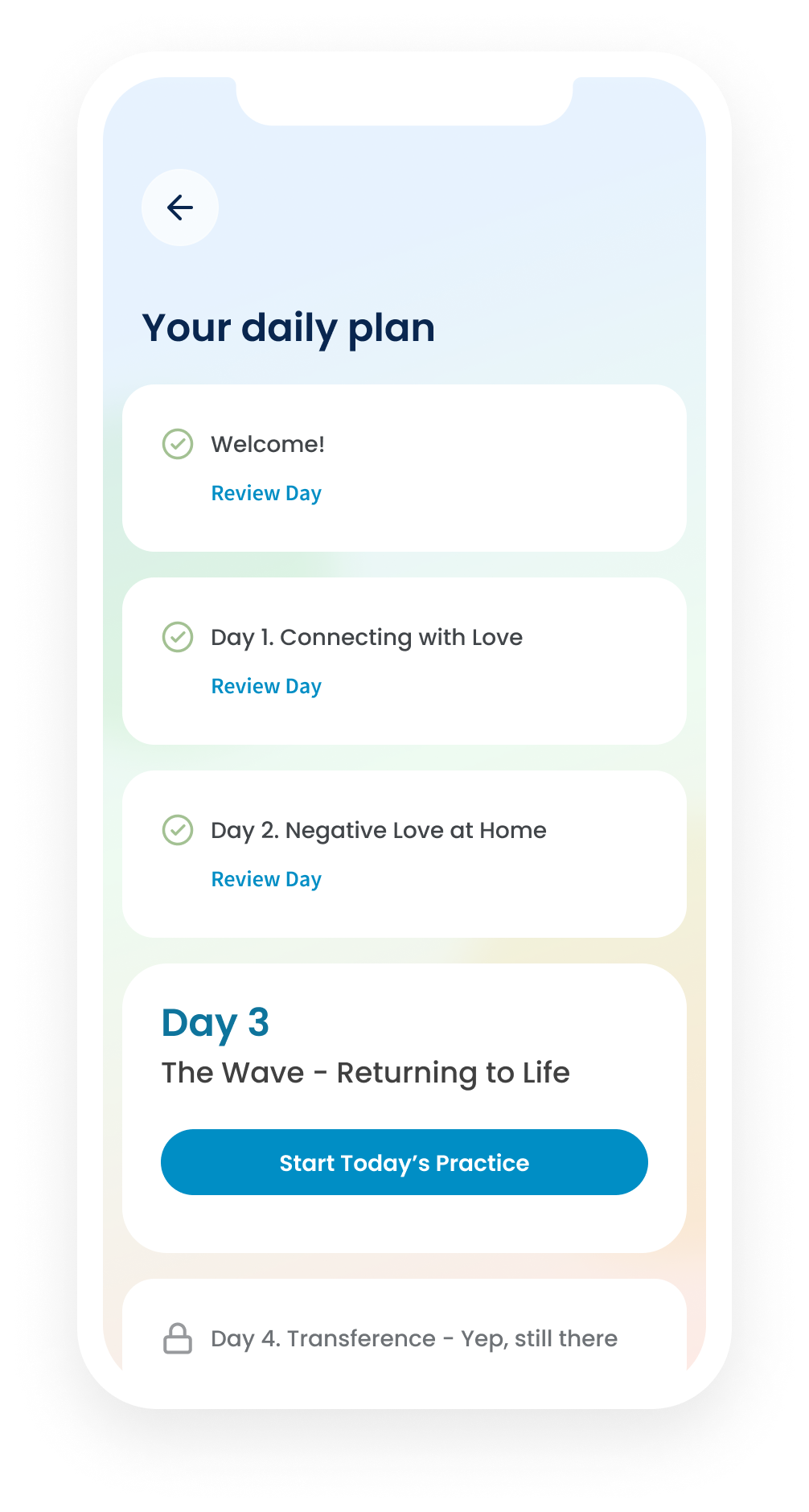
Work began on the app design after the branding was approved. Since we were starting from scratch on the app design- instead of redesigning the existing app -we had to work from the ground up. The experience of the user had to be thought through first by establishing the user flow and brainstorming rough wires.
Once the user flow was approved and the wires reviewed- I started focusing on the look and feel of the app before jumping into the design out the entire flow.
app user flow
The user flow served as a blueprint for the app specs on user interaction.
user flow built via whimsical
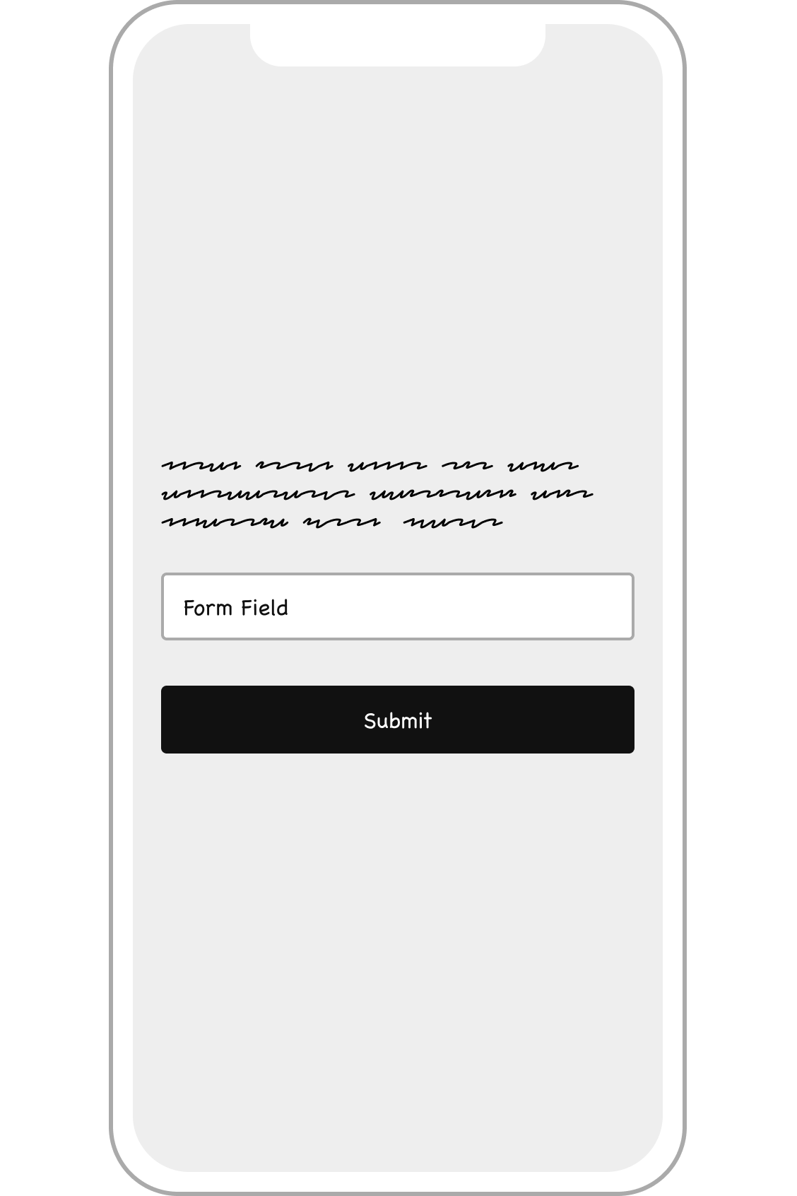
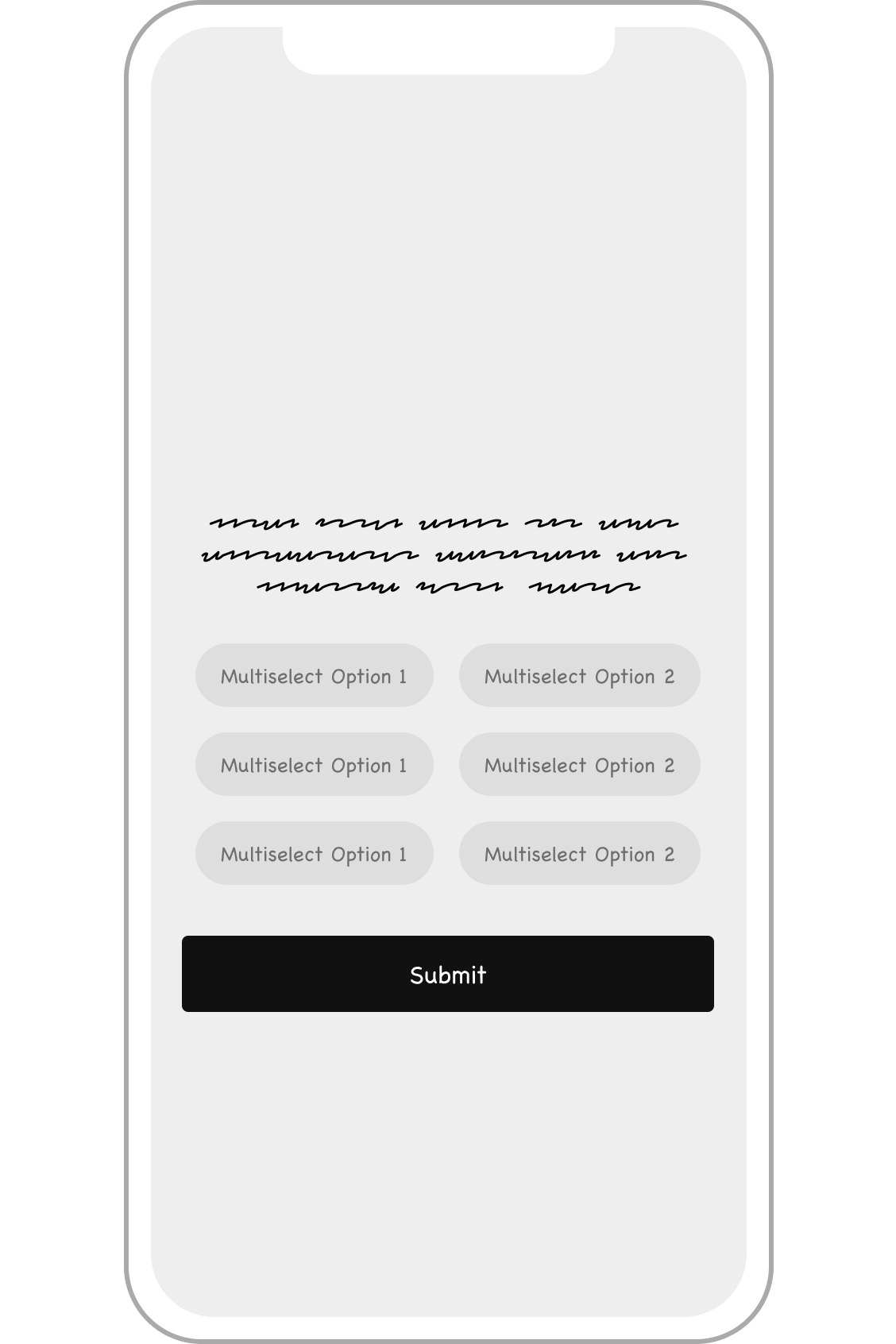
rough wireframes
The rough wires served as a fast step to narrow in on the structure of the app before moving into full color UI.
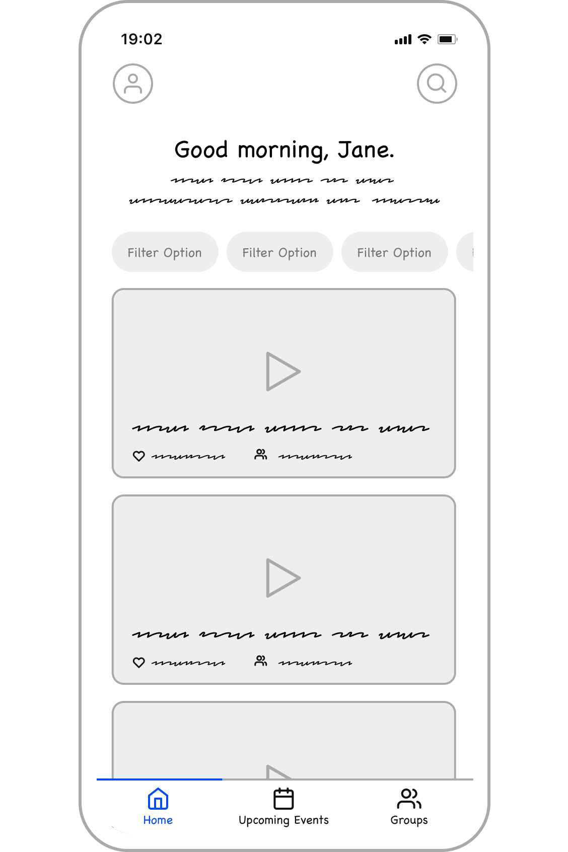
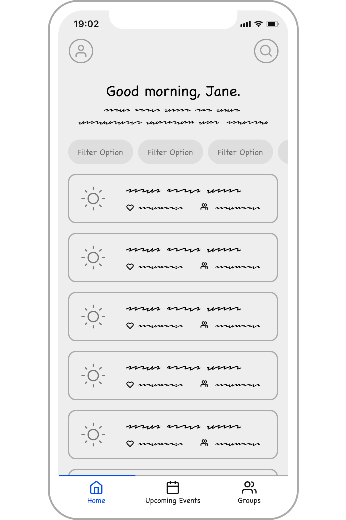
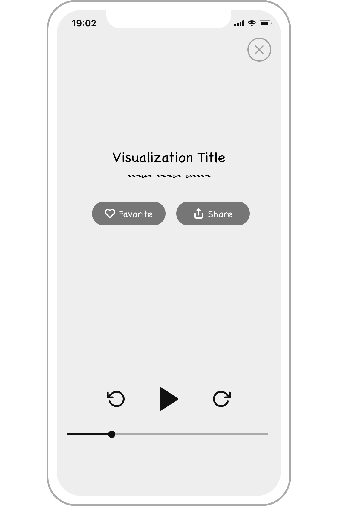
ui design explorations
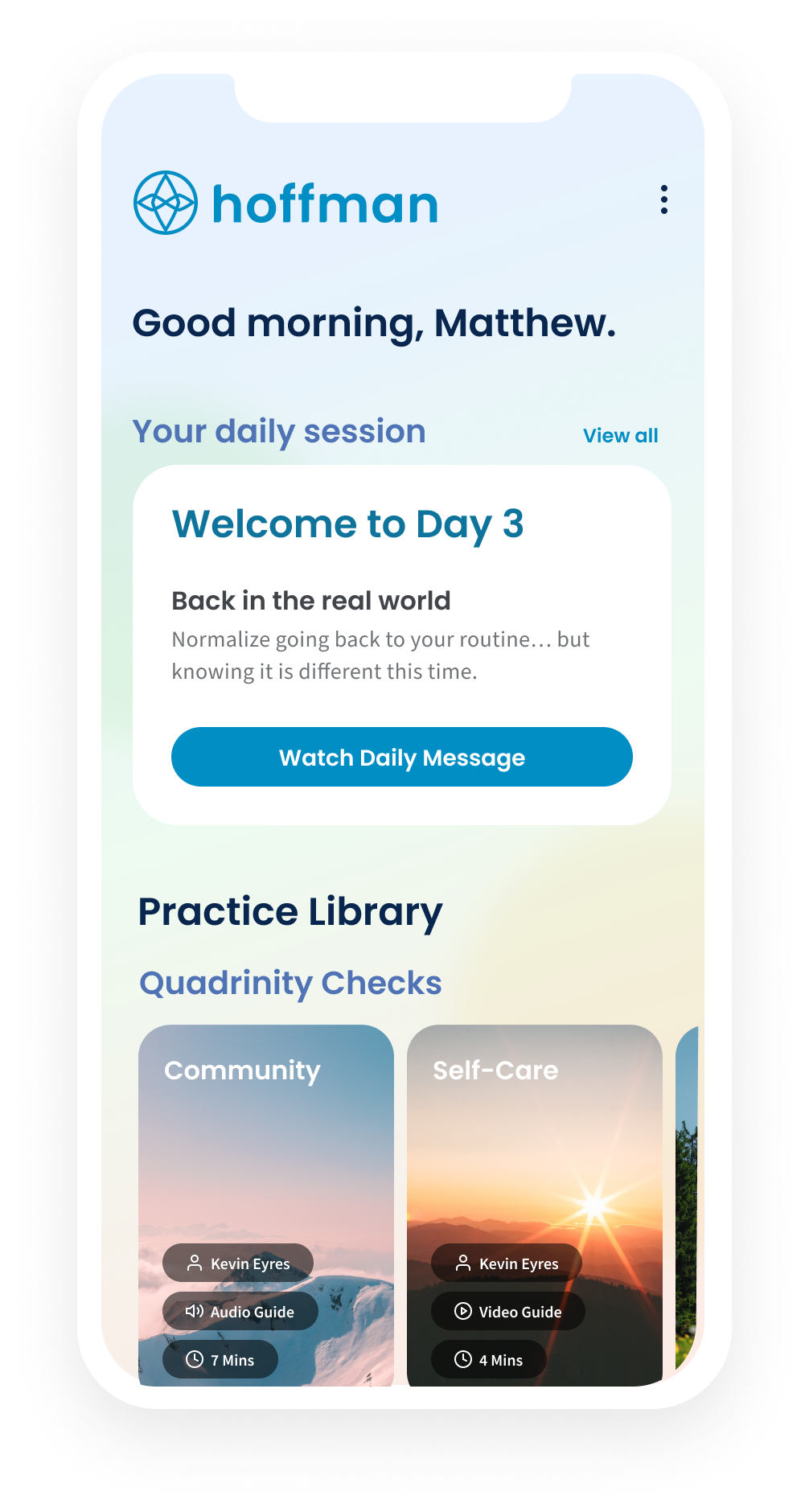
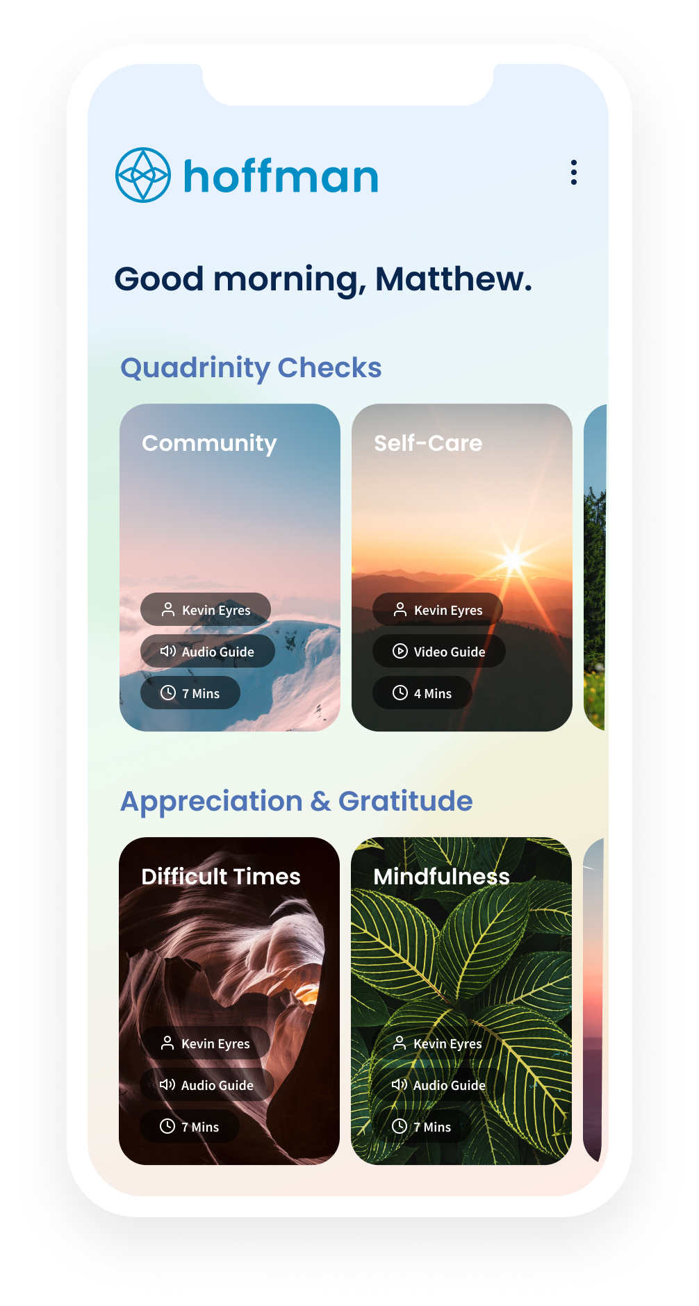
Since we were starting from scratch- I started working on quick design explorations to understand the client’s vision for the overall look in feel. I started with three general approaches- only designing a few pages to begin.
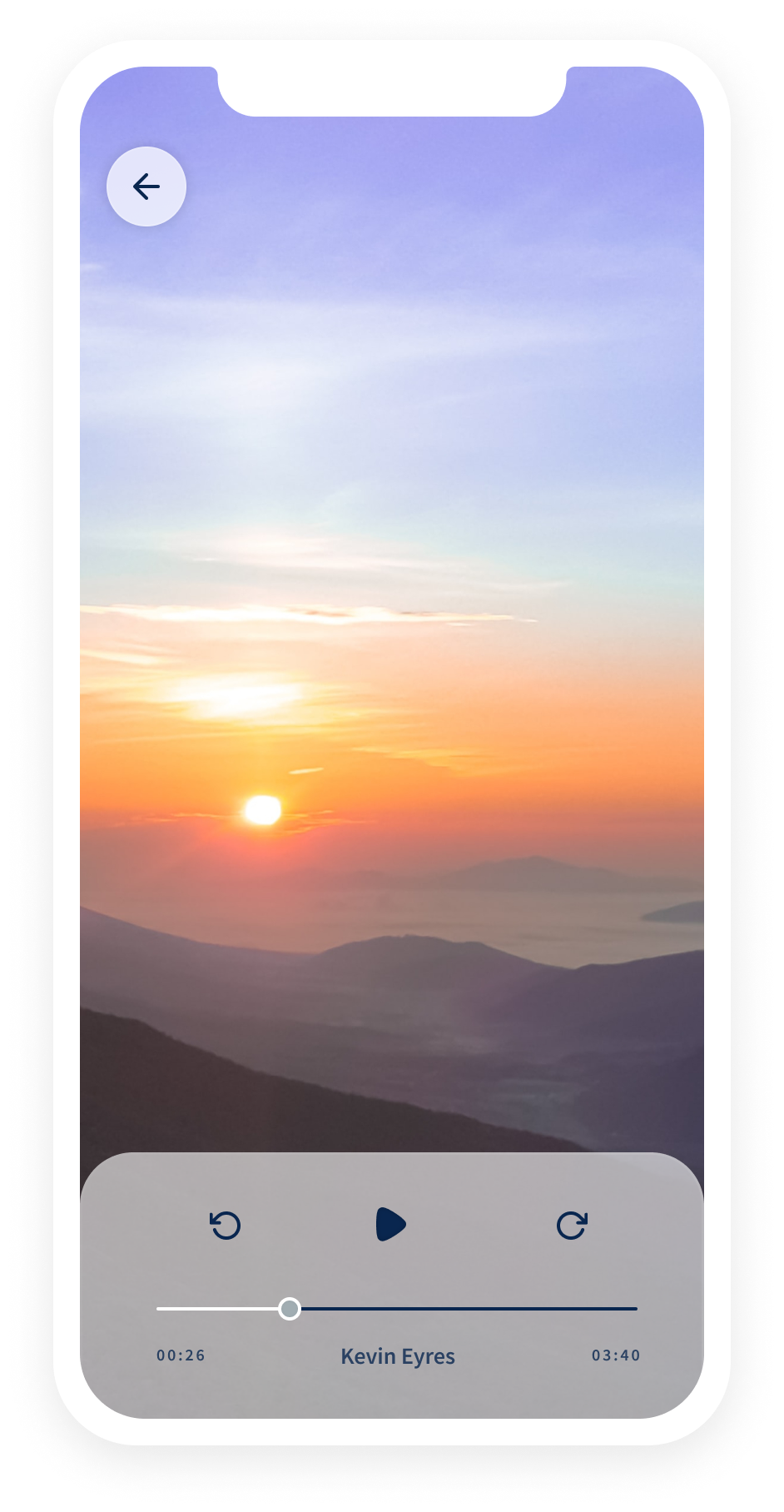
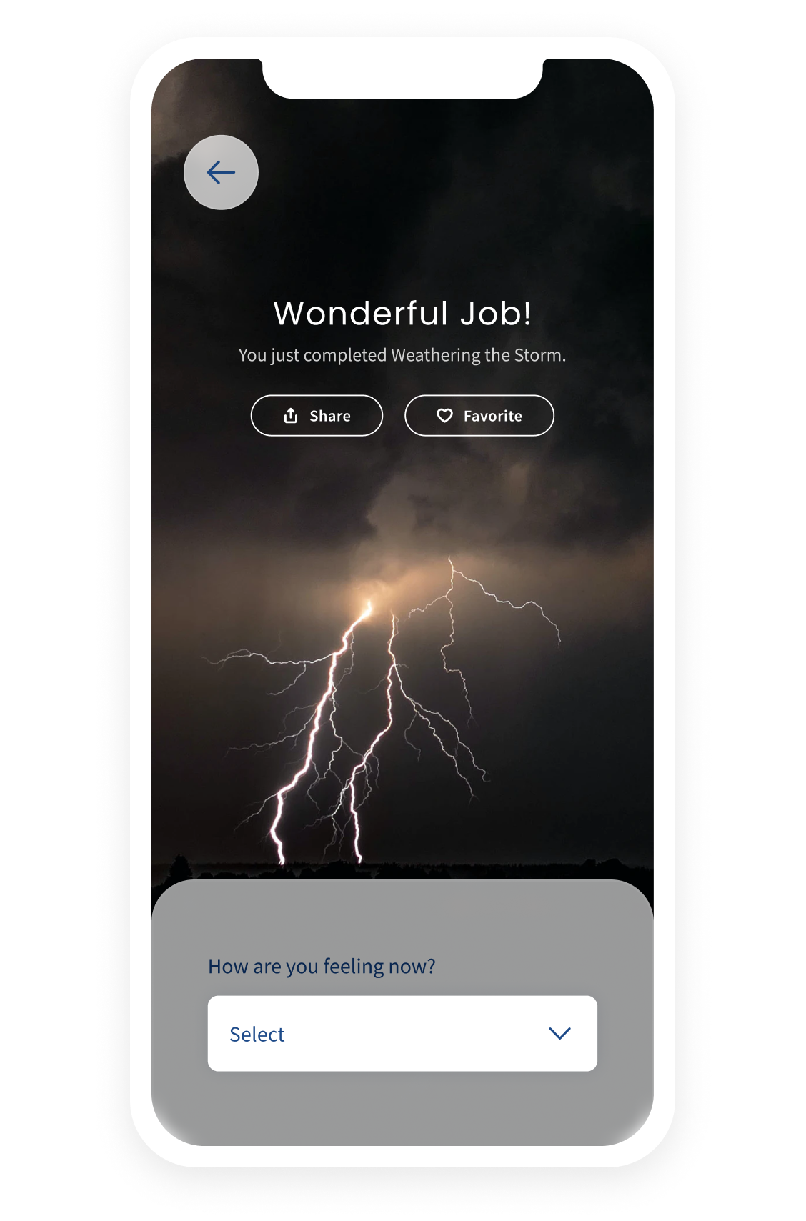
The final design style selected was a mixture of the photography focused with the addition of a bright color gradient inspired by the color focused designs.
photography focused designs
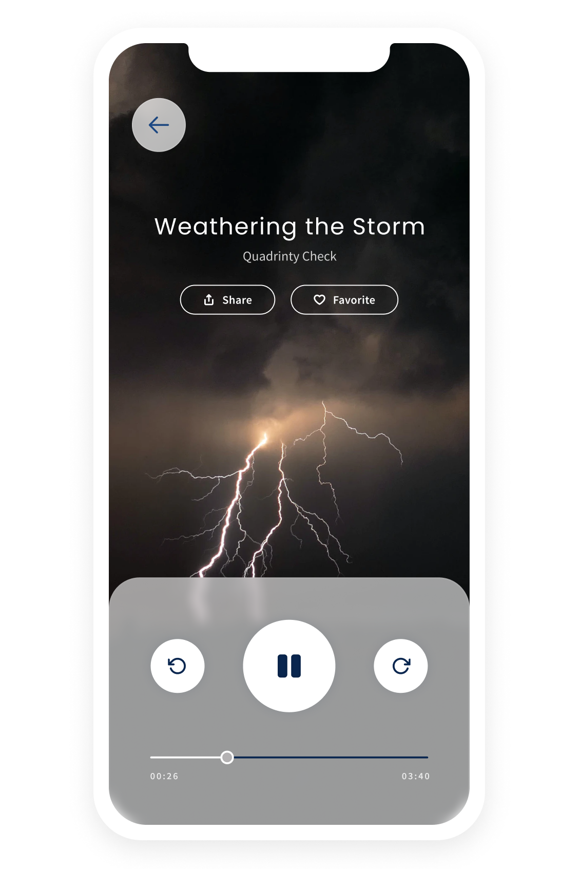
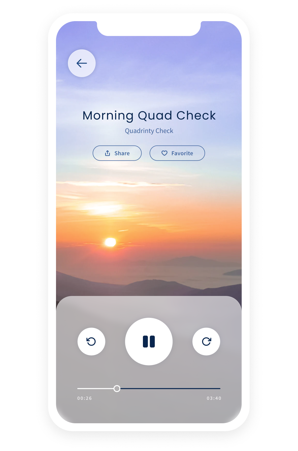
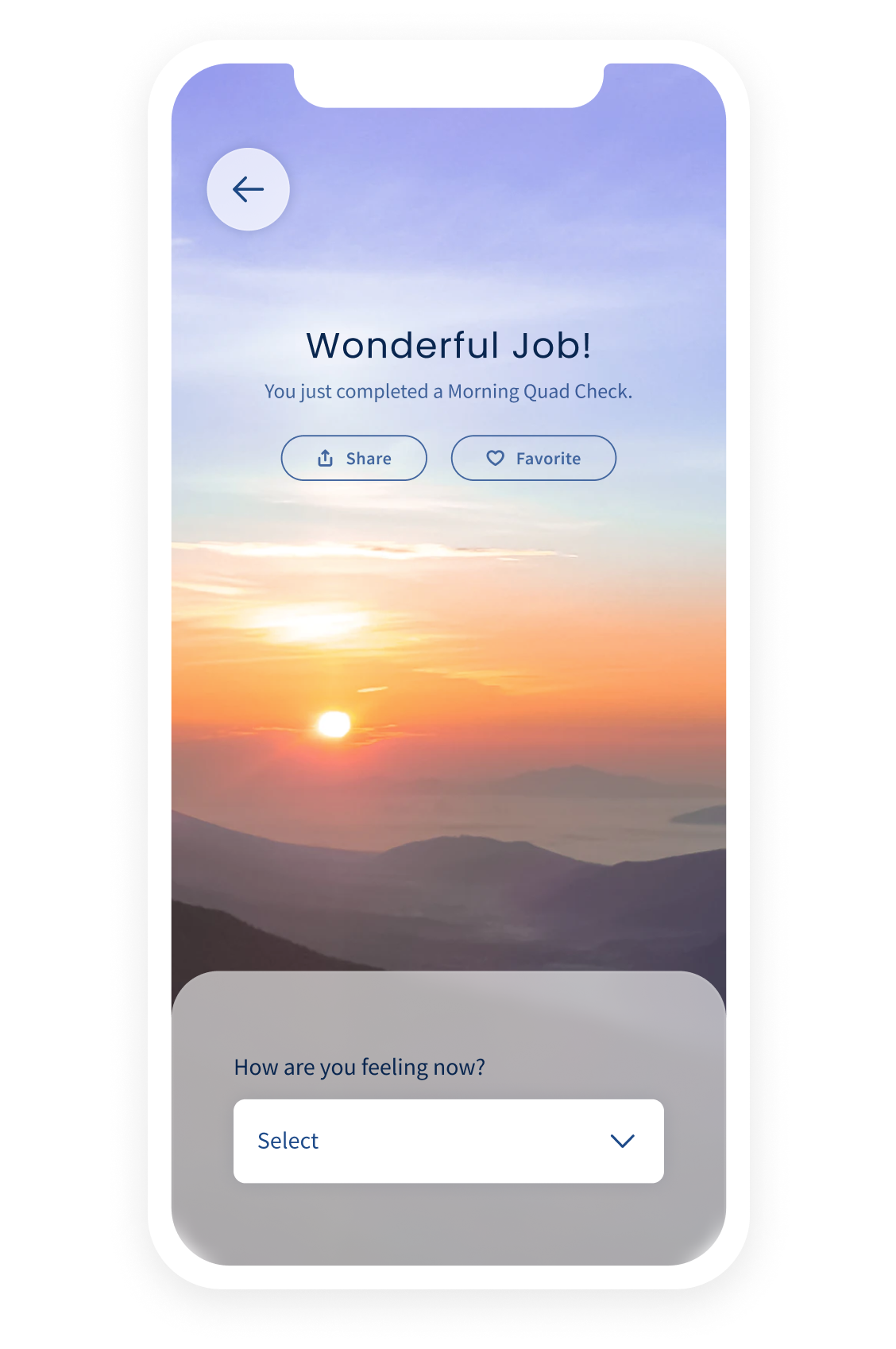
color focused designs
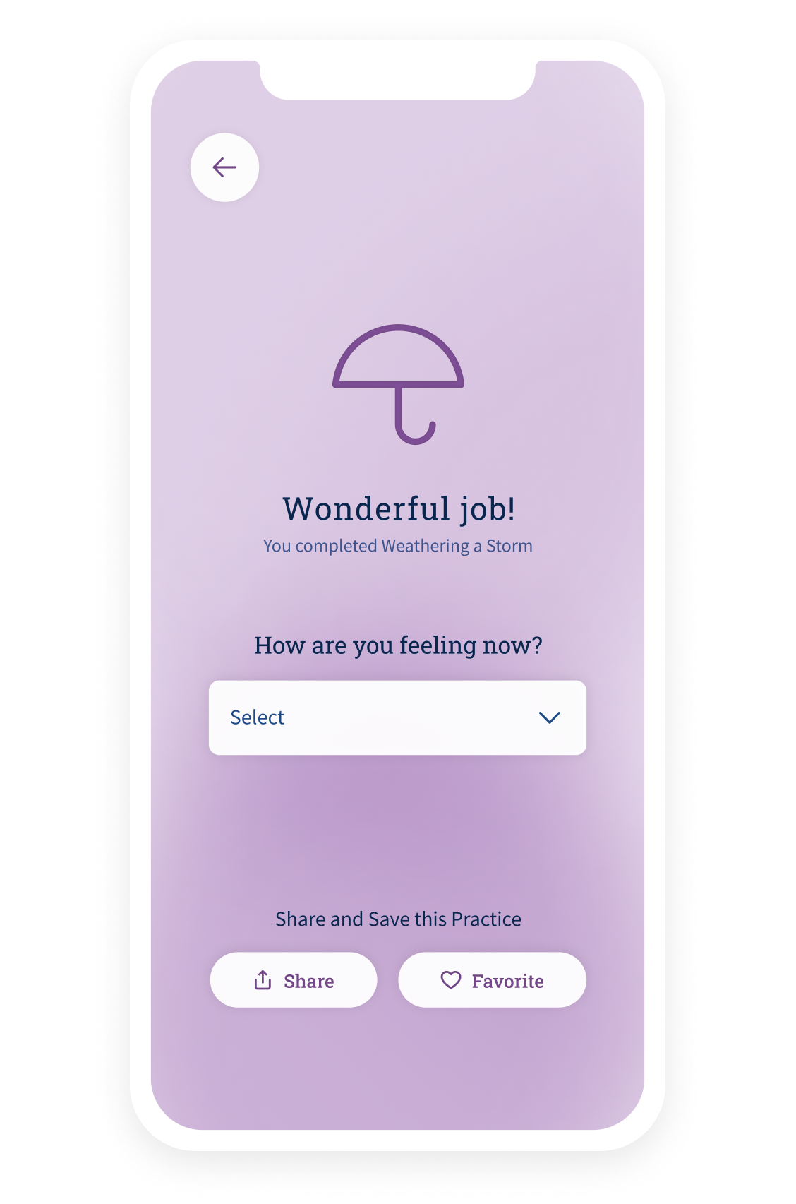
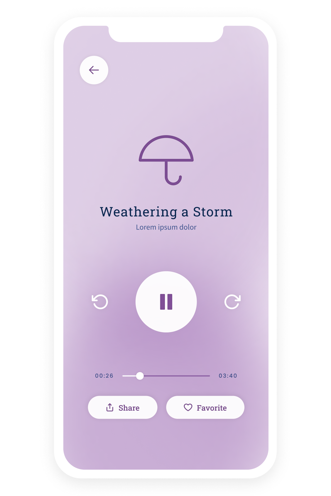
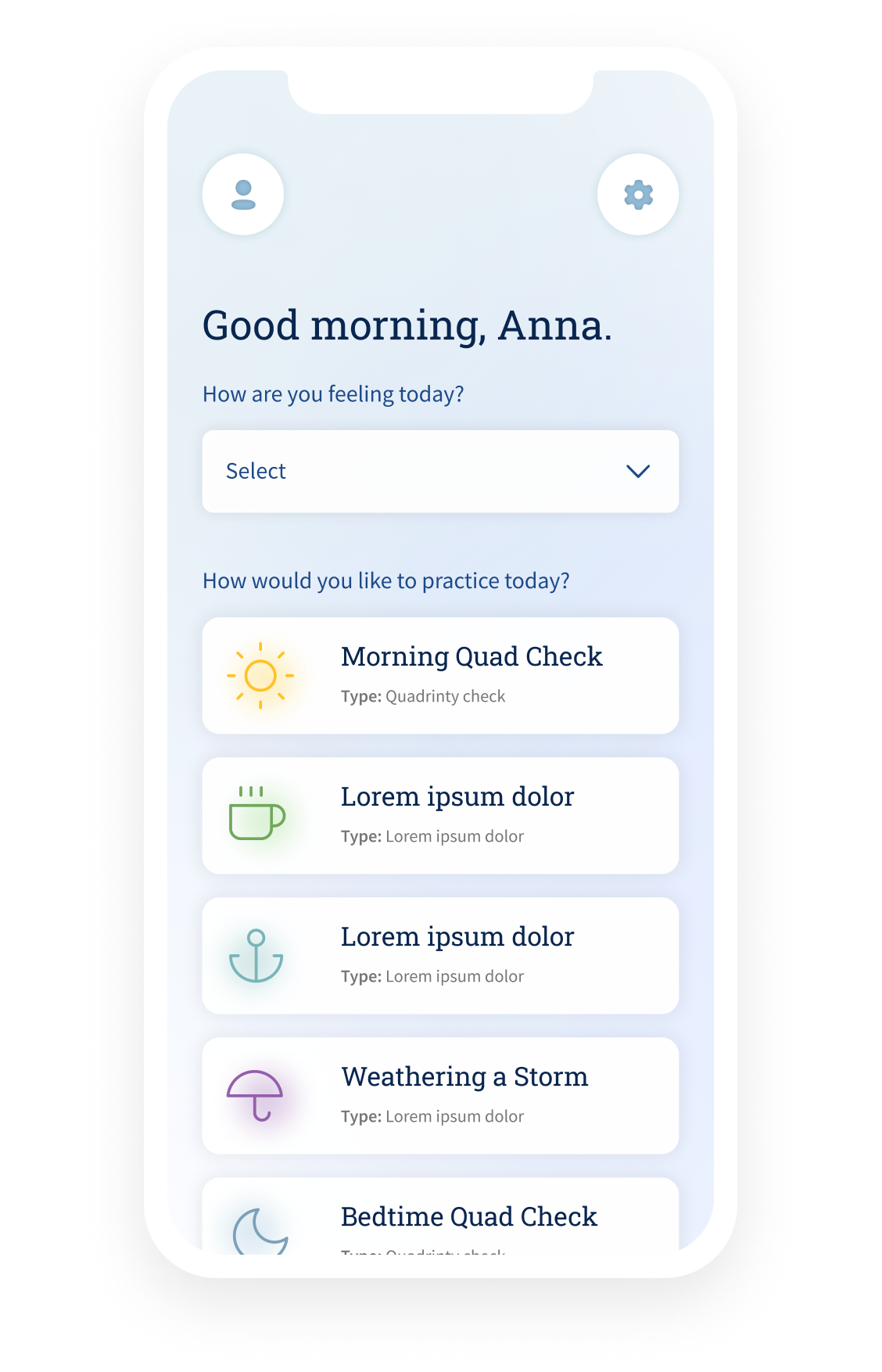
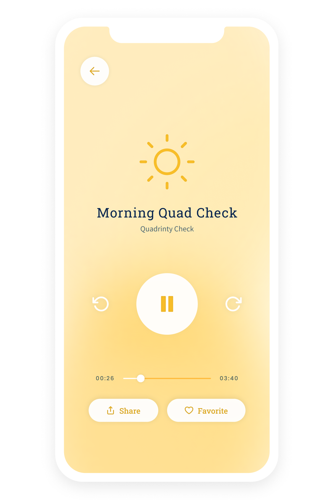
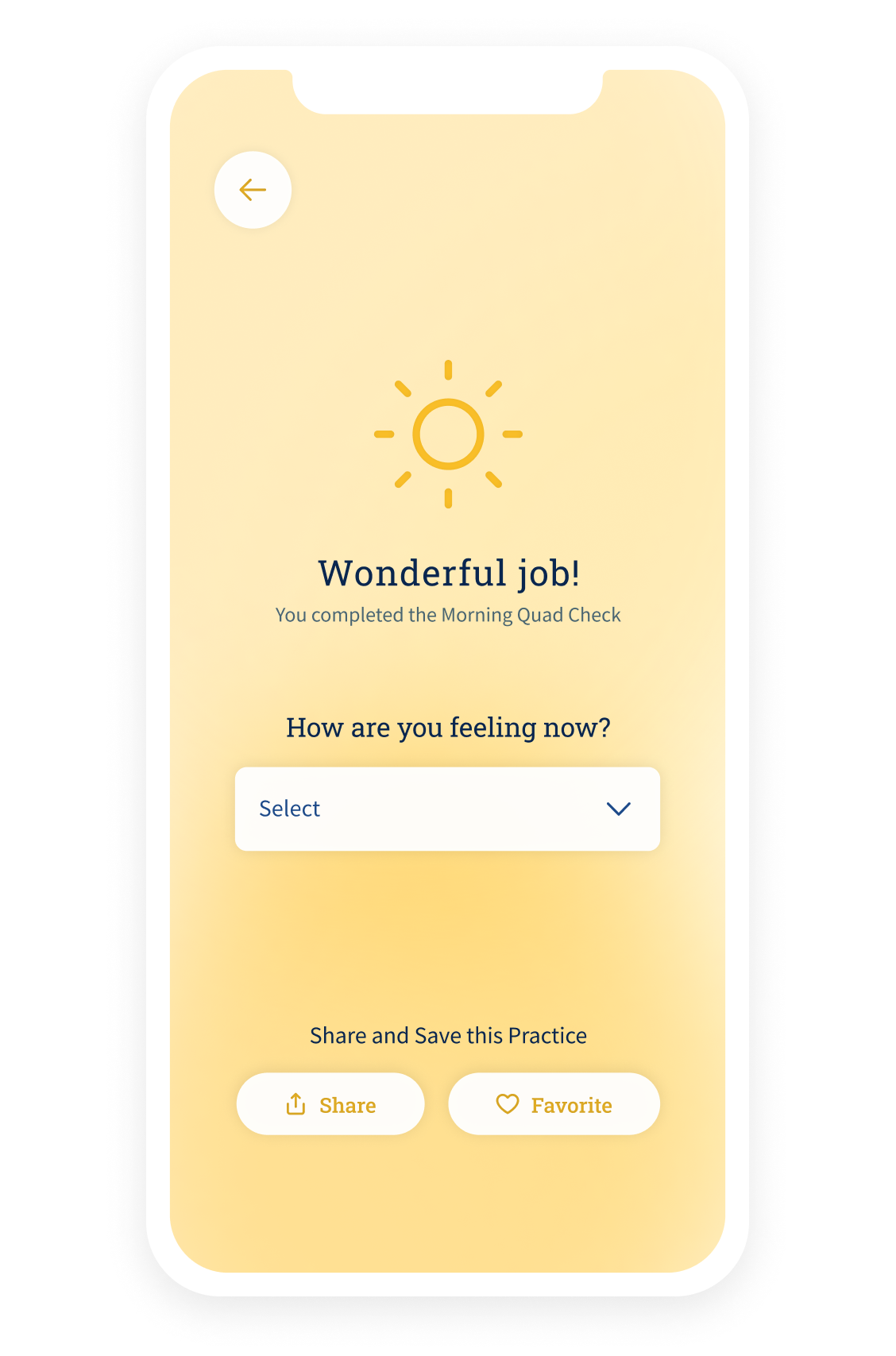
photo + color mix designs
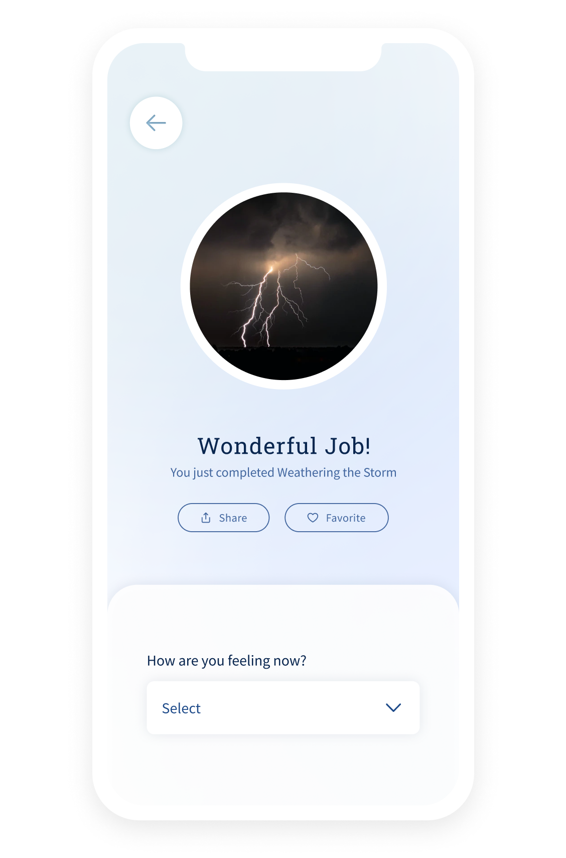
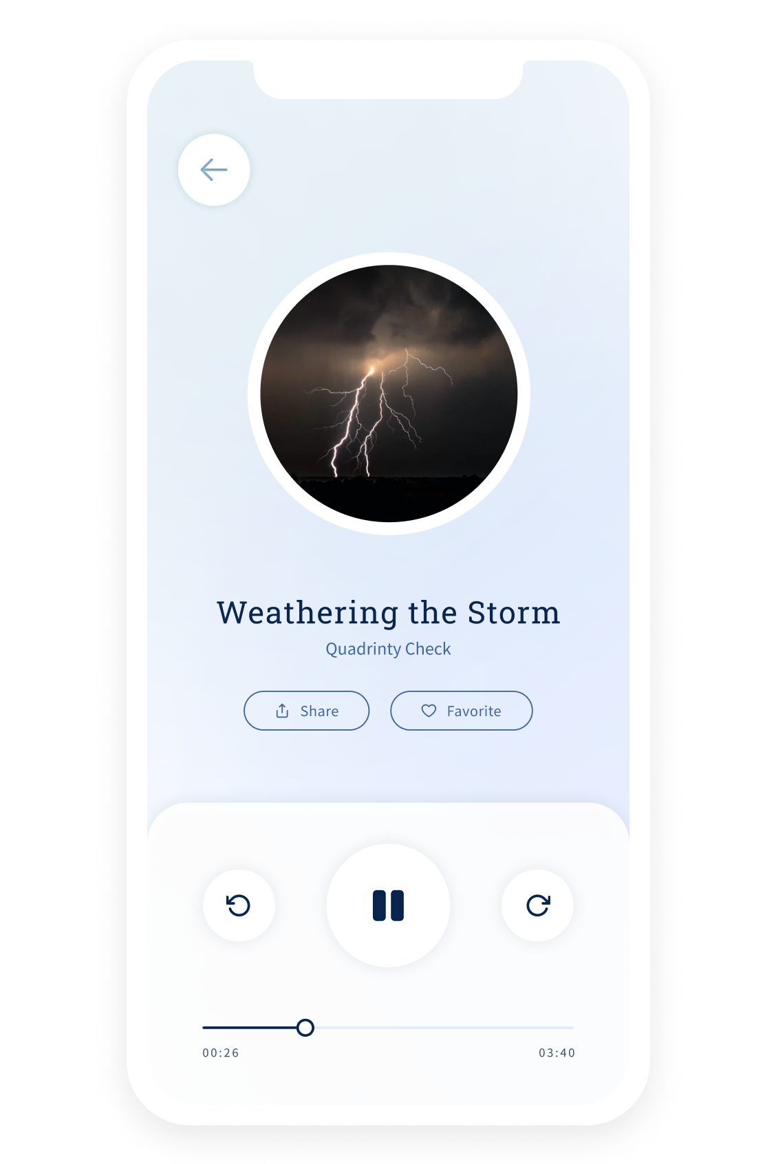
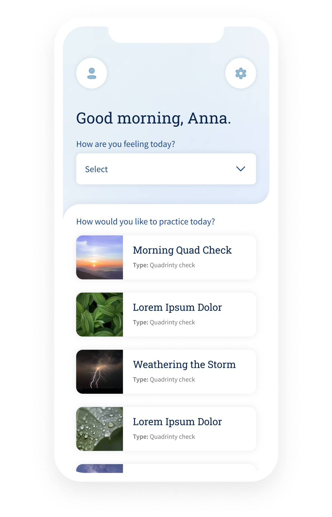
final design assets
With concepts approved- I began compiling a component library with foundational pieces being the main focus.


final designs